

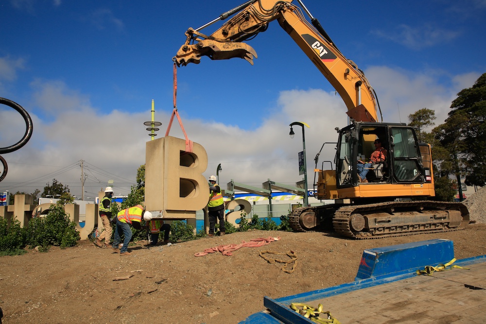
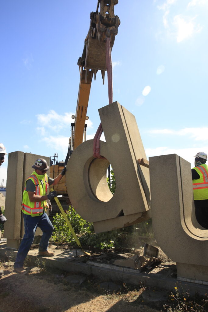
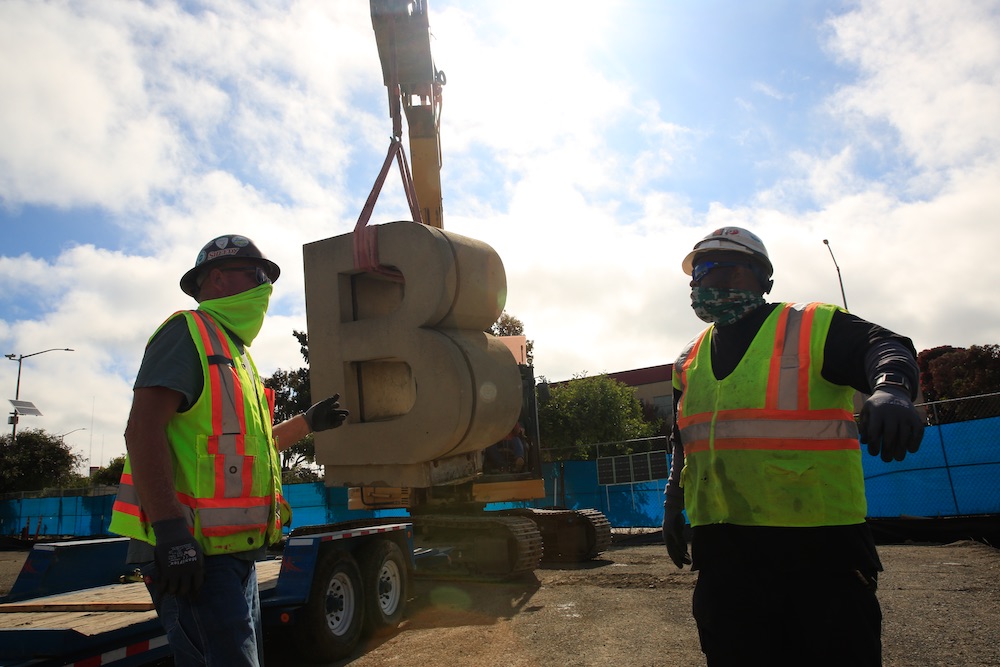
The concrete block letter lifted off the flat-bed trailer with a shudder. The articulated yellow boom-arm of the excavator rose slowly, hoisting the six-foot-tall ‘n’ into the air by a thick strap, shackled to a threaded steel eyelet. The eyelet’s hole had been bored into the top of the concrete letter more than 40 years ago, and could no longer bear its own weight for very long.
When the excavator cab swiveled around just a little too quickly, the large suspended ‘n’ sailed out in a wide arc. The eyelet tore loose and the one-ton concrete letter plunged to the earth with a ‘thud’ in the soft dirt. It tumbled forward into the shallow ditch right next to a capital ‘B’ and a lowercase ‘d.’ One worker—protected only by a white plastic helmet, N9 face mask, and yellow reflective vest—had leaped back quickly as the letter dropped at his feet. He cautiously returned to see the damage.
“It’s fine,” the young worker shouted. “No cracks.”
He signaled the operator to lower the boom so they could release the eyelet and get back to work. There were still 20 more concrete letters that crowned the long grassy berm along Third Street, that had once spelled out the words “India Basin Industrial Park.” By the end of the day they all needed to come down.
These iconic concrete slabs were created by San Francisco artist and designer Michael Manwaring, and have stood as a symbol of the Bayview Hunters Point community since 1978. But now, their future is in question as the old India Basin Industrial Park is leveled to accommodate the new Southeast Community Center. The letters, an expression of the 1970s “Supergraphic Movement,” may be lost forever.
When the San Francisco Public Utility Commission (PUC) decided to expand the wastewater treatment plant in the Bayview neighborhood, they had to move the old Southeast Community Center. So the PUC offered up a five-acre parcel less than a mile away at the corner of Third Street, a major transit artery that connects the southern neighborhood to downtown San Francisco. Centrally located, across from both the Bayview Shopping Plaza and a light rail stop on the T-line, the site had been the gateway to both Hunters Point and the Bayview, and would be an ideal location for a new community center.
Of course the land would have to be cleared—which would include removing the Manwaring Letters.
A supergraphic history

Manwaring grew up in the San Francisco Bay Area near Stanford University where his father taught. Art was never encouraged in his home, so he took out his creative talents on his high school classmate’s car, painting stripe designs and jagged flame outlines.
“My friend and I were cruising around San Bruno and I saw people turn and stare as we drove past,” Michael Manwaring remembered. “So, I told my friend to let me out so I could watch him drive up and down the street. I wanted to feel the effect of my design on the viewer. It was my first encounter with the idea of public art.”
Manwaring’s father refused to pay for art school, so Manwaring took a job driving a delivery truck in Palo Alto. Fearing his son would then get no formal education whatsoever, his father caved and in 1961 Michael joined the graphic design department at San Francisco Art Institute.
“Graphic design was looked down on by most of the other art students,” Manwaring said. “It was considered too commercial. I was pretty disappointed in my choice and considered leaving.”
But in his second semester a new teacher Jim Robertson, the head of a San Francisco design firm, took over his design class. Robertson looked at the students’ first semester work and declared it all “a pile of crap.” In what would become the great pivotal moment in Manwaring’s life, he stood up to the teacher, stating that design was not real art anyhow.
Robertson then challenged his student to look up the works of a number if European designers, among them, Swiss designer Josef Muller-Brockmann. Manwaring discovered what is known as the ‘Beethoven poster,’ the Muller-Brockmann piece from 1955 that had changed perceptions of modern design completely. For the first time Manwaring understood that when you strip away all the text and advertising elements, great design could also be great art.
“It was so free and beautiful,” Manwaring said. “Better than any painting I had seen at the Institute.”
A turning point for Butchertown
“Butchertown,” as the India Basin Industrial Park was once known as, and the rest of the Bayview, had been a center of industrial activity through the second world war, and a destination for the Great Migration, the movement that brought African American families out of The South to work in the militarized factories and shipyards. Bayview became an economic powerhouse for San Francisco and one of the cultural centers of the Black community, with wartime jobs offering living wages to both skilled and unskilled workers.
But within a generation of the war’s end many of the manufacturing jobs followed the returning White G.I.s to the suburbs. ‘White flight’ meant not only a loss of jobs, but also a barrage of racially segregated fiscal and civic policies, leaving behind economic devastation and urban decay.
In 1965, the mood in Hunters Point was tense. Following the killing of 16-year-old Matthew Johnson by a police officer, the community rose up in what became four days of protest and violence. Governor Pat Brown ordered the National Guard into the community to patrol the streets. This community resistance was hardly unique; across the country from Baltimore to Chicago, from New York to Los Angeles, Black communities that had been left behind in the economic boom that followed the war were making their voices heard.
The uprising made it clear to the City’s Board of Supervisors that with the impending closure of the Navy shipyard, and without new job opportunities directed at Bayview-Hunters Point, poverty and unrest would continue to plague the community. On January 20, 1969, the City adopted a redevelopment plan for much of Hunters Point which included the large industrial park and training center that would bring new jobs, new skills, and a revitalised economy back to the neighborhood. The India Basin Industrial Park was conceived.
Like the Fillmore’s, that Bayview redevelopment plan is now considered a catastrophic failure, one of San Francisco Redevelopment Agency head Justin Herman’s ruinous overreaches. But the Manwaring Letters escaped a toxic association with the Redevelopment Agency’s fiascos.
“The sign has always been a part of my history and I remember driving past it all the time and thinking, ‘This is right at the gateway into Bayview from the Evans Street side,'” District Supervisor Shamann Walton said. “I am extremely excited about the new community center that fulfills a piece of a promise, and one day we may find a way to bring the sign back, just like we did the 15 bus.”
Hitting on Helvetica
Bob Le Rocca owned a landscaping business and in 1976 had been hired by the City to design the industrial park’s surrounding scenery. With a meager budget, he begged Michael Manwaring to create a modest sign that would mark the entrance to India Basin.
“I think that $2500 was for the design and the production,” Manwaring said. “Bob had already been turned down by everyone, but I had just launched my own design business and I needed to get busy, so I took it.”
Manwaring started sketching a few ideas, but everything he came up with felt wrong for the wide open space. Then he remembered the advice he had gotten from Bay Area designer Barbara Staufacher Solomon: If something was not working it was probably not big enough. So the scale increased, until each letter grew to be at least six feet tall. With 24 six-by-four-by-four concrete letters, this would be a massive piece at the convergence of graphic design and sculpture. The sign became an architectural and placemaking powerhouse of dimensional “Supergraphics.”
“I chose to work in Helvetica font,” Manwaring said. “Today that seems obvious, but at the time Helvetica was revolutionary. It was the most important font ever created. The lowercase letters are beautiful, and elegantly support the capitals.” Manwaring used a combination of capitals and lowercase even though a sign like this might be expressed in all capital letters. He felt a row of capital letters standing between the street and the industrial park would overwhelm the viewer, like a wall, it would have been much less welcoming.
Once the style and scale had been established, Manwaring made another big decision. He would make each letter a free-standing, three-dimensional, sculpture.
Robert Indiana had experimented with text as art in his famous 1970 sculpture that depicts the word ‘LOVE.’ Manwaring incorporated the idea of large three-dimensional letters being used, but in this case in a practical application. Combining creativity into a practical application of form is the essence of public art and has informed much of Manwaring’s design work for over three decades.
“In America we find that art displayed in public spaces is usually advertising,” Manwaring said. “Cities in Europe have a long history of incorporating art and design into public projects. That was what I wanted this sign to be, public art.”
Le Rocca loved it. So much that he returned to the City’s project managers and convinced them to increase the budget so that he could accommodate the much more expensive gateway design. He added a long berm, or mound, that would run the 700 feet length of the property, and covered it with grass and trees to frame the letters. This much larger, more prominent design, would not only be a sign, it would define the entrance to India Basin for years to come.
Emblems of neighborhood history
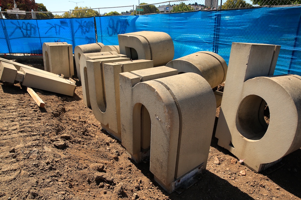
Now the land has been leveled. The skeletal structure for the new Southeast Community center has been erected, and the Manwaring Letters, at one point slated to be demolished, are being stored in a pit on the edge of the property thanks to the outreach efforts of Emily Rogers-Pharr, the new director of the center.
“Every brick in Bayview has a history to someone,” Rogers-Pharr said. “We did not want to move forward with our project until we had reached out to all community members.”
Community leaders immediately contacted the leadership of San Fracnsico’s Rec & Park to relocate the letters, or at least some of them, to the local India Basin Park, just a mile away, with no response. BUILD, a local developer, has agreed to store the letters on their land, but has made no promises to integrate them into the new 1500 units they are constructing along the waterfront.
Which brings up back to the beginning. A yellow Cat 320 Excavator, a flatbed trailer, a thick cloth strap, a heavy shackle, a worn-out eyelet screw, and a crew of five men—carefully lifting each letter off the cement pedestal that had been home for over 40 years and transporting them 300 feet to a shallow ditch where they would wait for a new home.
And when we contacted Michael Manwaring—now almost 20 years in retirement— for comment, he was thrilled to know that his India Basin Supergraphics might live on as a piece of San Francisco history. At least for now they were not destroyed.